Monthly Archives: April 2007
April 29, 2007
In the second installment of ancient Egyptian 101, we talked about phonograms, glyphs that represent syllables. Today we’ll turn our attention to ideograms, glyphs that represent entire words.
This is actually a sloppy use of the term ideogram; signs that represent words are technically called logograms. An ideogram is a sign that represents an idea. The walk/don’t walk lights at street corners, for example, are ideograms; the picture of the walking person doesn’t represent the word “walk” so much as the idea that it’s okay to cross the street.
However, for whatever reason, logographic languages tend to be referred to as ideographic, so that’s what we’ll do here.
There are around 800 glyphs in written ancient Egyptian; of these, most are phonograms but some are ideograms. (Many glyphs can serve as either one, depending on context, but we’ll get to that later.) (There are also determinatives, but we’ll get to those later too.) Ideograms are more straightforward than phonograms, both to explain and to read.
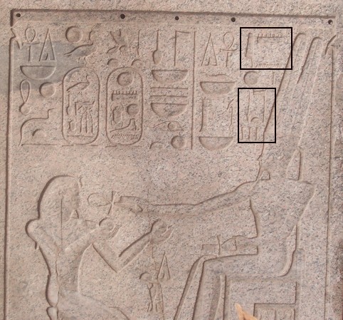
Last time we worked our way up to reading the inscription; we’ll start with it this time, and work backwards. The area I’ve marked contains the words for “king of the gods.”

Let’s break that down. The glyph all the way to the right represents a cloth wrapped around a pole (an ancient Egyptian emblem of divinity) and is an ideogram for the word [ntr], meaning “god” (the [t] is pronounced like, say, the final consonant in “my ex-boyfriend is a whoring bitch”).

So whenever you see this symbol, rather than having to remember what syllable it stands for and the figuring out what the syllables around it are and then deciding where the word breaks are and then looking it up in the dictionary and then not finding it and then crying because you are a miserable failure, you just know that it means “god.” Which, let me tell you, is a welcome relief.
The position of the glyph in this case indicates that it’s a genitive (crudely put, that you stick “of” before it), giving us “of the god.”
The last thing to note for now is the three little lines underneath the pole; these indicate the plural, which means that the second part of the marked area gives us “of the gods.”

Now let’s look at the first part, the word for “king,” made up of two phonograms, one representing a sedge plant (whatever the fuck that is) and the other representing a loaf of bread. The sedge plant stands for the consonants [sw]; the bread, for [t]. So the sedge-plant and bread glyphs stand for [swt], “king,” right?

Wrong.
The word for king is not [swt] but [nswt].
“What the fuck happened to the [n]?” I hear you cry. The answer is: They left it out. Because the inscription looked nicer that way.
I’ve dated people like them.
The word [nswt], “king,” is in fact written with our old friend the water glyph, standing for [n]:
![]()
So when the word [nswt] is written out in full, it looks like this, right?

Wrong.
Because the Egyptians, being a very aesthetically driven people (as we all know from Anne Baxter’s outfits in The Ten Commandments), found all the white space above and below the [n] and above the [t] displeasing. So they just moved the [n] to the other side; this is called graphic transposition. The word for “king” looks therefore like it’s spelled [swnt]. But it’s not.

This happens all over the place in hieroglyphic inscriptions. Luckily, some smart ancient Egyptians came up with a way to figure out whether this transposition is operating in any given case, and that way is you just have to know it and if you don’t then you’re fucked.
I’ve dated people like them, too.
Whoever carved the inscription in the present case took this principle a step further. Since spelling [nswt] with the [n] over the [t] would mean that the glyph for [ntr] might have to move a little bit to the right, which would in turn leave unpleasant white space, he just left the [n] out too. This, too, happens all over the place in hieroglyphic inscriptions, and this, too, operates according to the you-just-have-to-know-it-and-if-you-don’t-then-you’re-fucked principle. So you have the sedge-plant glyph and the bread-loaf glyph as well as a water glyph that’s been first transposed and then omitted*, standing for [nswt], “king.” Followed by the (pluralized) cloth wrapped around a pole, this gives you [nswt ntrw], “king of the gods.”

Putting that together with what we learned last time, we now have [jmn nswt ntrw], “Amun, king of the gods.”
The perspicacious among you may object to my having skipped the circle and the line in between the two marked portions of the inscription.
To which I reply: good things come to those who wait**.
*By the way, the transposition-omission bit can get even more confusing when, for example, the [t] bread loaf doesn’t appear in [nswt] either, which leaves you with the sedge-plant glyph to represent the word for “king.” Unless it represents [sw], the word for “him.” Unless it’s doubled and represents one of the words for “this/these.” Unless it’s doubled and represents one of the words for “not.”
Really, I have to give Champollion a lot of credit, because after five minutes with the Rosetta Stone I would totally have given up and gone to get ice cream.
**By the way, I’m making good progress on figuring out how to say “ass-fucking”; I’ve gotten “anus” and “backside.” Unfortunately I’ve found three different words for “pierce,” and I can’t figure out for the life of me what the different connotations are. And when one is dealing with ass-fucking that’s something one really doesn’t want to get wrong.
April 28, 2007
So today I watched the 2006 pilot of Aquaman (a.k.a. Mercy Reef).

Can somebody tell me why the fuck this show wasn’t picked up?
April 27, 2007
Okay, I just watched Wednesday’s Top Model.
Did they actually show Natasha walking down the house practice runway in blackface?

April 14, 2007
N.B.: I’m futzing with my comment mechanism. If you try to leave a comment and something funky happens, fear not; before long all shall be well and all shall be well and all manner of thing shall be well.
April 14, 2007
From the online journal of Dr. Saad Eskander, the Director of the Iraq National Library and Archive:
Jesus Christ.
April 11, 2007
Okay, it’s time for the second installment of ancient Egyptian 101. Since the first installment I have acquired a scanner, so fasten your seat belts.
(Something to keep in mind: “Hieroglyph” is a noun, referring to one of the symbols used in ancient Egyptian writing. “Hieroglyphic” is an adjective describing the writing system. So please don’t allow yourself to say things like, “The hieroglyphics on the walls of the tomb made me hard.” Please.)
Like most people, I used to think that each hieroglyph represented a word, sort of like how each Chinese character represents a word (such languages are commonly known as ideographic)*.
Like most people, I was wrong.
While it’s true that some glyphs represent words, more often than not glyphs are to be read phonetically, as consonants or groups of consonants. (Like ancient Hebrew writing, hieroglyphs represent only the consonants; the vowels are to be supplied by the reader. This isn’t as complicated as it sounds; if you saw “Grg W Bsh s th wrst prsdnt vr” you wouldn’t have too much trouble figuring out that it said “please, God, can we just skip to January 20, 2009?” especially if you were used to reading in this way.)
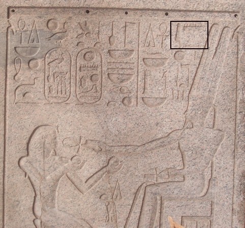
So this glyph, for example, representing a reed leaf, stands for the consonant [j].

This one, representing an owl, stands for the consonant [m].

This one, representing water, stands for the consonant [n].
![]()
“Amun” is the conventional rendering of the (divine) name made up of the consonants [jmn]. So this is how you write “Amun,” right?

Wrong.
Because the name of the god Amun is no more written with the leaf, owl, and water symbols than “airport” is spelled “eyreport.” I’m sure that when the ancient Egyptians texted each other they took shortcuts, but on sarcophagi they seem to have eschewed the ancient versions of “thru,” “thanx,” and “b4.”
So instead of the writing above (you say “writing” instead of “spelling”), the name “Amun” uses this glyph, representing a game board and game pieces, which stands for the consonants [mn].

So this is how you write “Amun,” right?

Wrong.
Because, since evidently carving these goddamned things into rock walls wasn’t tedious and difficult enough already, the Egyptians tended to add things called phonetic complements. A phonetic complement is a single-consonant sign that appears on either side of a double- or triple-consonant sign for absolutely no reason at all**. It would be sort of like writing “ass-fucking g” to make sure the reader knew the word ended with a “g,” or “c cocksucker” to make sure the reader knew the word started with a “c.”
And the writing of “Amun” has a phonetic complement. So this is what it looks like:

Which is, as you can see, the first set of glyphs in this picture, at the top of the column directly to the left of the seated figure on the right.
Coming soon: ideograms and/or vowels.
My God, this is so much fun.
*Yes, I know that this kind of language is more correctly called logographic than ideographic, but give me a break. This blog is called The Search for Love in Manhattan.
**Okay, there are certain instances in which the phonetic complement helps clarify things, but those instances, as far as I can tell, are few and far between.
